 111
111 2
2 3
3 4
4 5
5 6
6 7
7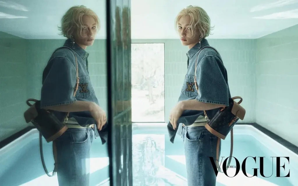 8
8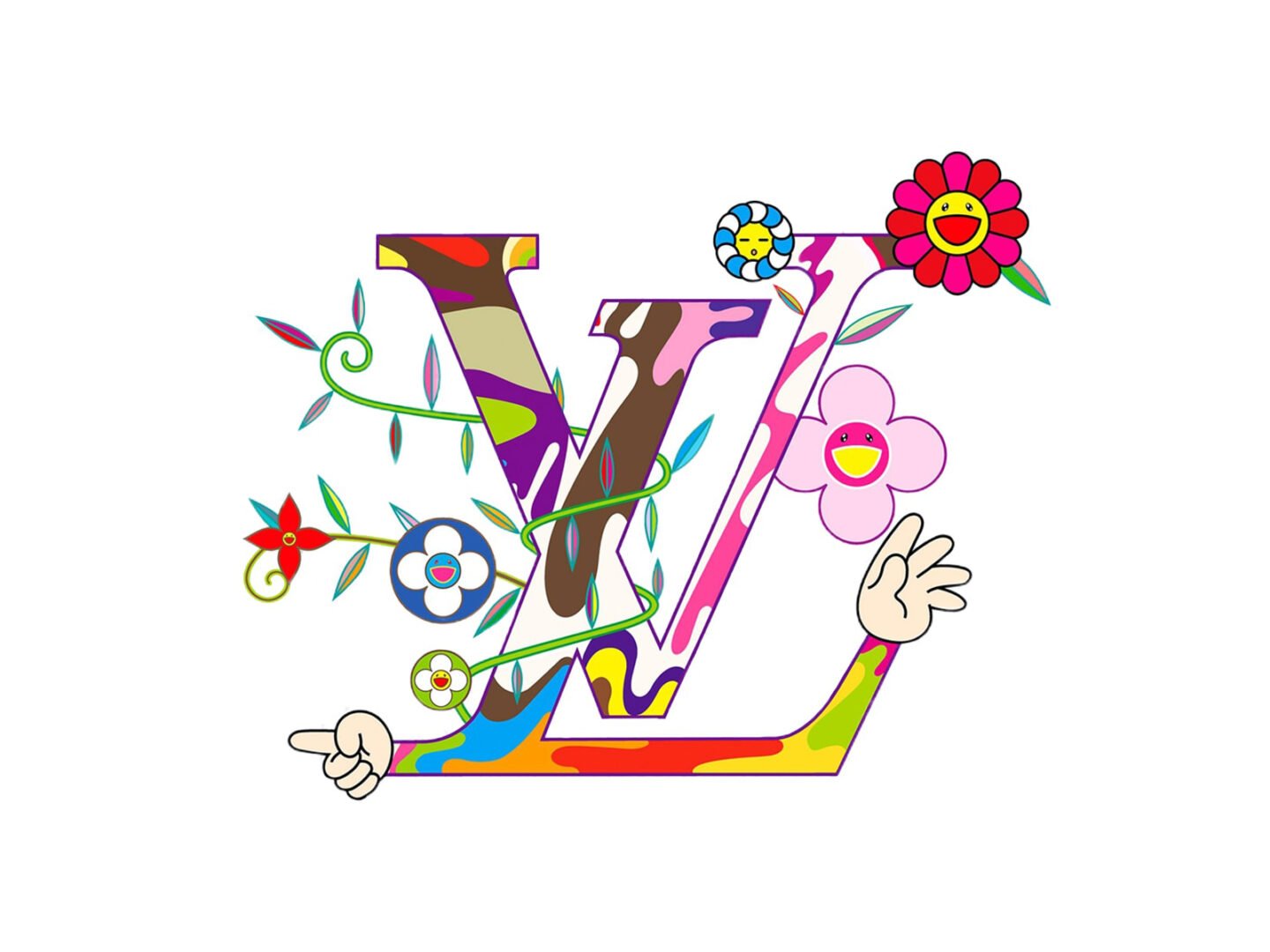
Everyone’s tired of “collab culture” by now, and honestly, fair enough , when every week brings another logo mashup, the word “collaboration” starts to mean almost nothing. Two names stamped on the same hoodie isn’t a conversation. It’s a transaction with better marketing.
But there’s an older, stranger lineage of fashion collaboration that has nothing to do with hype drops, and it’s worth remembering it exists , because it’s a genuinely different thing. Not two brands splitting a logo. An artist and a designer, actually arguing with each other through fabric, until neither discipline looks quite the same afterward.
THE ORIGINAL: SCHIAPARELLI AND DALÍ
If you want the actual origin point of art entering fashion as an equal partner, not a print, it’s Elsa Schiaparelli and Salvador Dalí in the 1930s. Their first project together, in 1935, wasn’t even a garment , it was a powder compact designed to look like a rotary telephone dial. From there it escalated fast: in 1937, Dalí painted a lobster directly onto one of Schiaparelli’s silk evening gowns, taking the image from his own 1936 sculpture Lobster Telephone. The dress became genuinely infamous when Cecil Beaton photographed Wallis Simpson wearing it for Vogue, on her honeymoon with the Duke of Windsor, lobster strategically placed with an implication nobody in 1937 needed explained to them.
The pair kept going. There’s the Shoe Hat, from Winter 1937-38 , a black-and-pink hat literally shaped like a high-heeled shoe, inspired by a snapshot Dalí’s wife Gala had taken of him wearing one on his head as a joke. There’s the Tears Dress, from 1938, its silk printed with a trompe-l’œil pattern that makes the fabric look torn, like flesh, pulled directly from a Dalí painting called Necrophiliac Spring that Schiaparelli owned. And there’s the Skeleton Dress, which used a quilting technique to raise a human ribcage in relief straight out of the silk, worn on the body like the body’s own interior had been turned inside out. Dalí even followed her into perfume , designing the bottle and advertising for Schiaparelli’s 1946 fragrance Le Roy Soleil.
None of this reads as “artist licenses image to brand.” It reads as two people who found each other’s obsessions genuinely useful , Dalí got a body to put his surrealism on, literally, and Schiaparelli got permission to make fashion as unsettling as she’d always wanted it to be. It’s the reason fashion historians still call their partnership the first real art-fashion collaboration, full stop, not just an early example of one.
THE ONE THAT WEAPONISED THE FASHION AD ITSELF: COMME DES GARÇONS AND CINDY SHERMAN
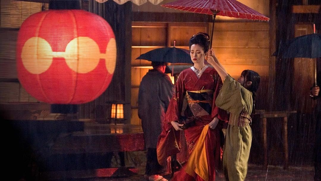
Skip forward to 1993, and something almost opposite happens. Rei Kawakubo, having seen a Cindy Sherman fashion editorial in Harper’s Bazaar, got in touch and simply gave the photographer clothes from every Comme des Garçons collection and full creative freedom to shoot them however she wanted. What Sherman handed back for the label’s Autumn/Winter 1994-95 campaign wasn’t glamour. It was, in the words of one archive describing the work, a series of repellent, pitiable caricatures modeling the clothes instead of the usual desire and aspiration fashion advertising runs on, a punk with tattoos and piercings, a clown-like figure, a stiff, unsettling geisha.
It’s worth sitting with how strange that decision actually was, commercially. A fashion house’s entire advertising campaign is normally built to make you want to look like the person in the photo. Kawakubo handed the campaign to an artist famous for making viewers deeply uncomfortable with exactly that impulse , Sherman had spent her whole career using self-portraiture to interrogate the roles society hands women, not celebrate them. The resulting images function less like an ad and more like an argument about what fashion advertising even is, dressed up as one. One archive later called it Comme’s most famous, most successful collaboration , not despite how uncommercial it looked, but partly because of it.
THE ONE THAT WOULDN’T STOP: LOUIS VUITTON AND YAYOI KUSAMA
Not every great collaboration is a single explosive moment. Some are a slow-burning, decades-long conversation, and Louis Vuitton’s relationship with Yayoi Kusama is the clearest example fashion has right now. It started in 2012, under Marc Jacobs, when the house transformed its classic monogram trunks and leather goods with Kusama’s hand-painted polka dots , a motif she’s described, consistently, across a seventy-year career, as her personal language for infinity and self-obliteration. Every dot across the entire collection was overseen by Kusama herself, each brushstroke checked against her own hand.
Ten years later, under Nicolas Ghesquière, the house didn’t just repeat the formula , it went further, expanding into menswear for the first time, adding fragrance, jewellery, footwear, entire flagship stores wrapped floor to ceiling in dots, animatronic Kusama figures waving from shop windows in Paris and London. The house itself described the relationship, in a 2023 press statement, as one that never actually ended between the two collaborations , that the conversation simply continued and expanded over the decade in between.
What’s genuinely rare here isn’t the ambition. It’s the duration. Most fashion collaborations are built to expire in a season. This one has now run, in two extended chapters, across more than a decade , precisely because it was never a licensing deal in the first place. It was Kusama’s own hand, verified brushstroke by brushstroke, both times
THE ONE THAT LEFT THE RUNWAY ENTIRELY: PRADA AND REM KOOLHAAS
The strangest, and maybe the most ambitious, collaboration on this list barely touches clothing at all. Prada’s relationship with the Pritzker Prize-winning architect Rem Koolhaas and his firm OMA has now run for more than twenty years, and across that time it’s produced Prada’s flagship stores in New York, Los Angeles, San Francisco and Tokyo, the semi-annual architecture of its runway shows themselves, and , most significantly , the entire Fondazione Prada arts campus in Milan, which reopened in 2015 in a complex combining seven existing industrial buildings from a 1910s distillery with three new structures, including a tower coated entirely in gold leaf.
Koolhaas has been explicit that the project wasn’t meant to resolve into a single coherent image the way most cultural buildings do. In his own words, the Fondazione deliberately keeps old and new, horizontal and vertical, open and enclosed in permanent, unresolved tension with each other, rather than letting one architectural idea dominate. That’s not a description of a building commissioned to promote a fashion house. It’s a description of an actual architectural philosophy, developed in genuine collaboration over two decades, that happens to have Prada’s name on the door. Miuccia Prada didn’t hire an architect to build her a nice store. She found someone whose relationship to fragmentation and contradiction matched her own, and let him build an entire cultural institution around that shared instinct.
I’ll be honest — when the teaser dropped in December 2024, that grinning bear, Tan Tan Bo, popping up out of nowhere, I actually gasped. Not exaggerating. Twenty years since Marc Jacobs first let Murakami loose on the monogram, and Louis Vuitton brought the whole thing back for 2025 like it had never really left: Zendaya fronting the campaign, the Multicolore reissued, that Cherry Blossom print I’ve been obsessed with since I was a teenager rolling back out that spring, plus jewelry, leather goods, even a new fragrance, all dropped in chapters across the year instead of dumped at once.
And look, I know it’s nostalgia by design. That’s fine. What actually gets me about this one is how completely Murakami’s aesthetic — that flat, candy-colored crash between ukiyo-e, manga and anime — stopped being a “collaboration” a long time ago and just became part of how the monogram looks in my head. An entire generation grew up not knowing the LV logo without his fingerprints on it. So bringing it back in 2025 wasn’t really a reunion. It was Louis Vuitton finally admitting out loud what the rest of us already knew: this one never actually ended, it just went quiet for ten years. I’m still not over it.
MANOLO BLAHNIK × BALENCIAGA: A HOUSE FINDING ITS FOOTING, QUITE LITERALLY
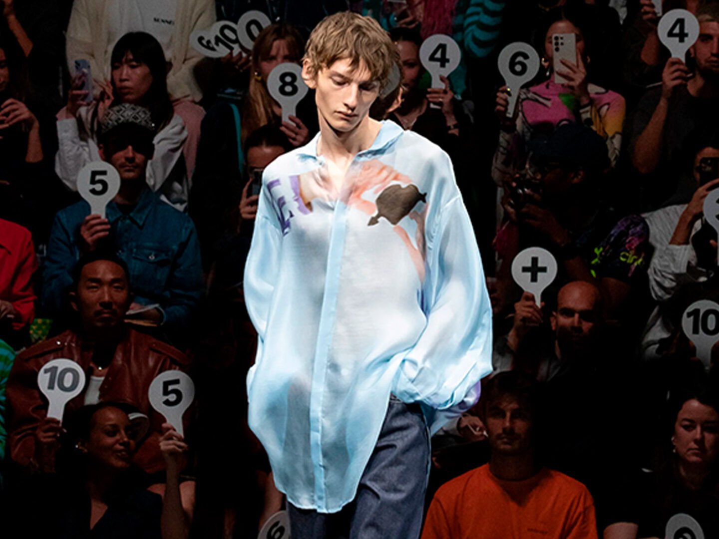
Since Pierpaolo Piccioli stepped into Balenciaga, you can watch him unpicking the house from everything Demna built, season by season — and the shoes are where it shows the most. Which is what makes tapping Manolo Blahnik such a pointed choice. This is a man who still carves his own prototypes by hand, who has spent his whole career being almost stubbornly selective about which houses get to use his name.
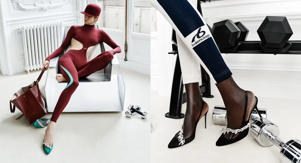
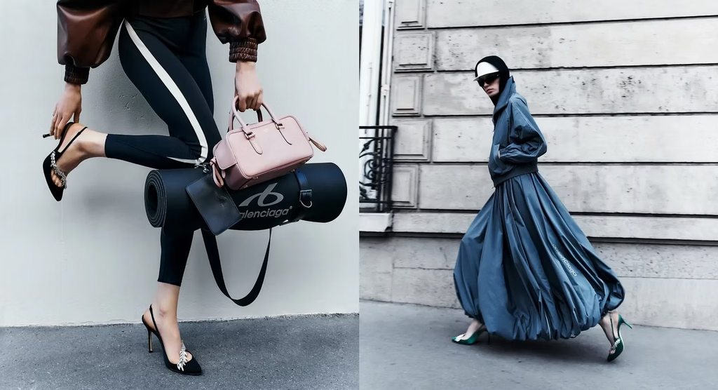
So this isn’t a logo-mashing exercise, and it doesn’t read like one. It’s Piccioli borrowing someone else’s decades of restraint to say, without saying it outright, exactly where he’s taking the house next , romantic, referential, quietly technical instead of loud. Compared to almost everything else dropping right now, it’s a genuinely quiet collaboration. That’s kind of the whole point of it.
WHAT ACTUALLY MAKES ONE OF THESE WORK
Put these four side by side and the pattern that separates them from a Supreme drop becomes pretty obvious. None of them are a logo borrowed from one context and stamped onto another. Every one of them is built on a designer finding an artist whose actual preoccupations , surrealism and the body, for Schiaparelli and Dalí; the fabricated nature of desire, for Kawakubo and Sherman; infinity and repetition, for Vuitton and Kusama; contradiction and fragmentation, for Prada and Koolhaas , genuinely overlapped with their own, and then giving that person real authorship over the result, not just a licensing fee.
That’s the actual difference. A collaboration built on shared obsession tends to outlast the season it launched in , Schiaparelli and Dalí are still taught in art history classes ninety years later; Vuitton and Kusama are still going, a decade and counting. A collaboration built on borrowed logo equity rarely survives past the resale market. One of these is a conversation. The other is a transaction wearing a conversation’s clothes , and once you’ve seen the real thing, it’s hard not to notice the difference immediately.
All images featured in this article are credited to owners . They are used for editorial and illustrative purposes only, with no commercial intent. All rights remain with their respective owners.