 111
111 2
2 3
3 4
4 5
5 6
6 7
7 8
8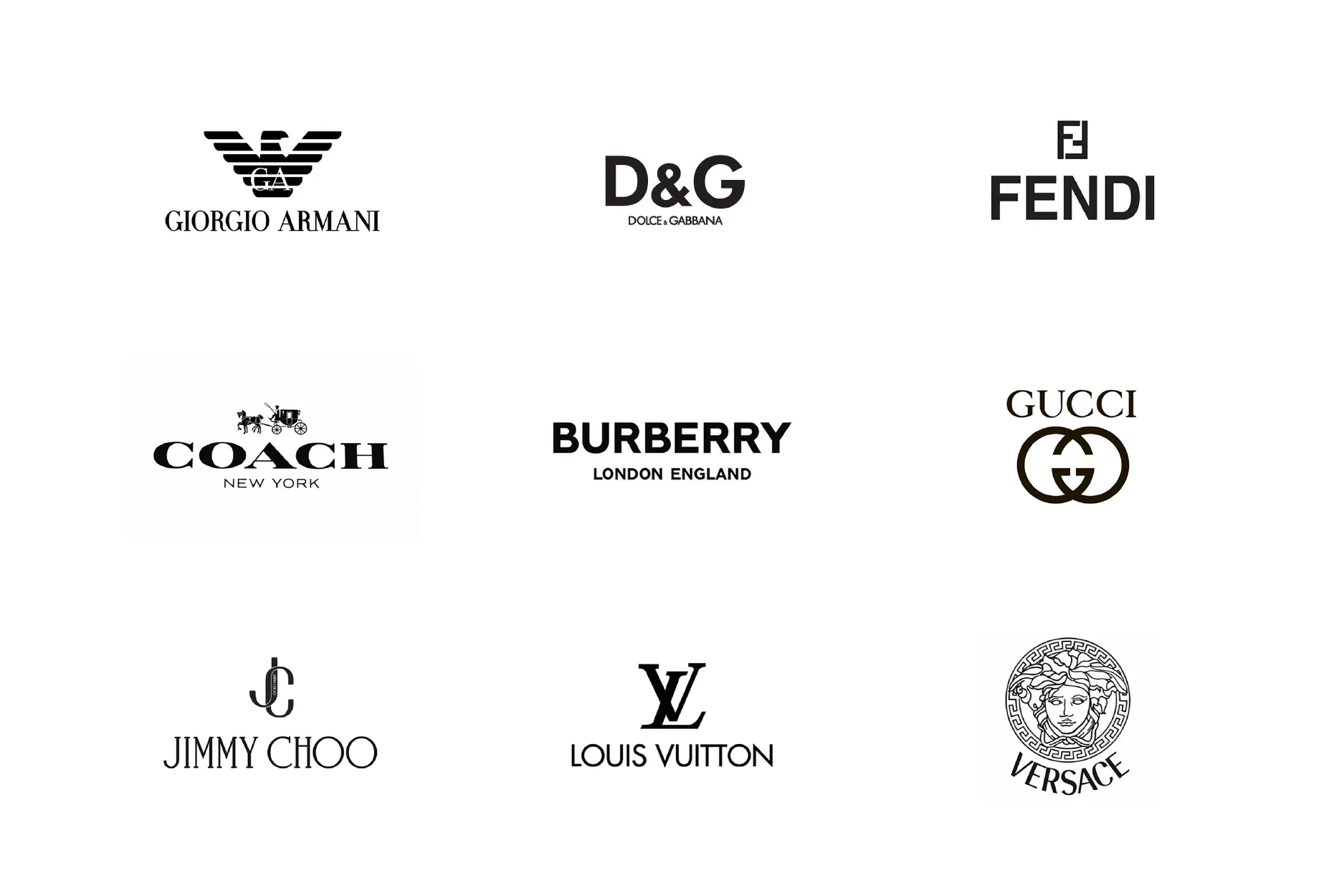
Stop someone on the street and ask them to name a luxury brand. Go on, try it in your head right now. Chances are you didn’t picture a silhouette, or a stitch, or the way a coat moves when someone walks. You pictured a symbol. The double C. The LV. The interlocking G’s. That’s the reflex, and it’s not really our fault , it’s the one thing fashion has spent a century training us to reach for first.
Here’s the illusion, though, and it took me an embarrassingly long time to actually see it: the designers who built the most recognisable houses in the world were never trying to get famous for a logo. They were trying to get recognised before anyone even clocked that there wasn’t one.
HOW WE GOT HOOKED ON LOGOS IN THE FIRST PLACE
It’s worth understanding where this reflex even came from, because the origin story is genuinely funny in hindsight. The Louis Vuitton monogram , that interlocking LV surrounded by flowers, one of the most copied patterns on earth , was designed in 1896 by the founder’s son, Georges Vuitton, for one specific reason: to stop people from counterfeiting the bags. The logo was invented as an anti-piracy device. It is now, itself, the most counterfeited symbol in the entire fashion industry. Sit with that irony for a second, because it explains almost everything that came after.

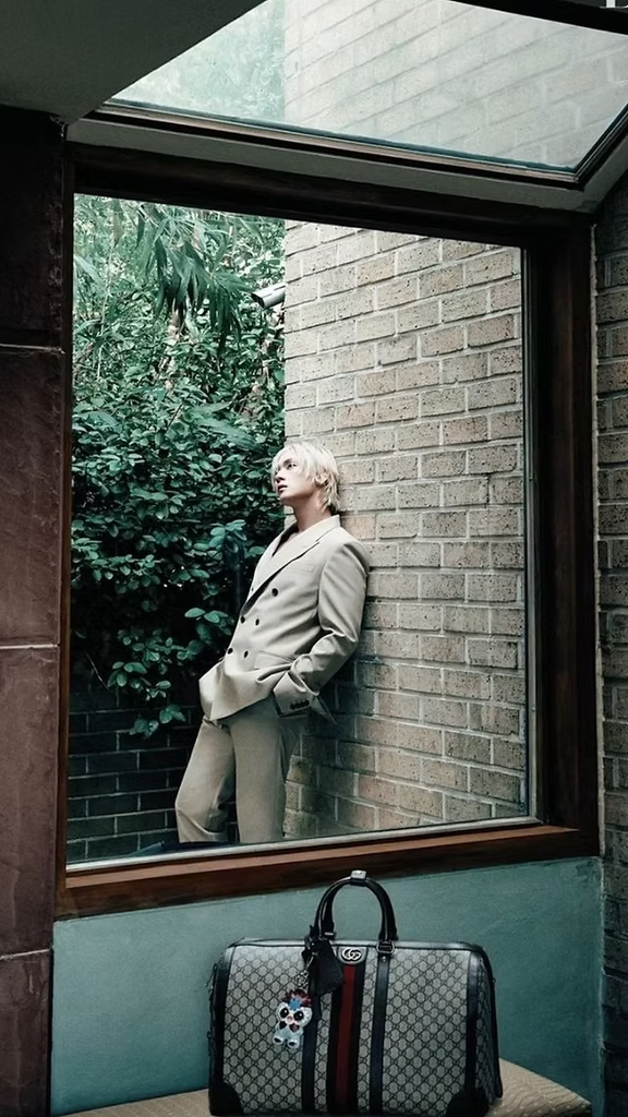

Gucci didn’t even bother with its now-iconic double-G until the 1960s, more than forty years after the house was founded , for decades, it simply didn’t feel it needed one. But the real explosion came from somewhere nobody in Paris or Milan expected: Harlem, in the early 1980s, where a designer named Dapper Dan started screen-printing Gucci, Fendi and Louis Vuitton monograms onto leather goods for a clientele the fashion houses themselves were actively ignoring. He called his pieces “knock-ups,” not knockoffs , remixes, tributes, not forgeries , and in doing so he more or less invented the aesthetic that would come to define an entire decade. By the 1990s, logomania had gone fully mainstream: Fendi’s double-F splashed across everything up to and including strollers, Calvin Klein waistbands, monogram bags nobody bothered to be subtle about. Branding had migrated from the inside of the garment to the outside, and the outside was where it stayed for almost twenty years.
Then 2008 happened, and the mood flipped almost overnight. Flaunting a logo in a recession reads badly, and a genuinely quiet minimalism took over the runways for the better part of a decade , before logos came roaring back again in the 2010s, because fashion, it turns out, never really settles anywhere for long. Which is exactly why the houses that opted out of that whole cycle entirely are so interesting. They didn’t wait for logos to go in or out of fashion. They built something the trend cycle simply couldn’t touch.
RECOGNITION WITHOUT A SINGLE SYMBOL
Nobody proves this better than Bottega Veneta. The house’s own founding line, going back decades, was blunt about it: “When your own initials are enough.” No visible branding, ever, by design , not a slip-up, not a phase, an actual founding principle, arguably the most quietly radical positioning statement in twentieth-century fashion. Instead, in the 1970s, the house developed intrecciato, a technique of hand-woven leather strips that became, in effect, its logo , except you can’t stamp a weave onto a counterfeit the way you can fake a gold buckle. It takes real skill, real time, and a trained eye to spot the difference, which is precisely why it’s so hard to fake convincingly.

Under Daniel Lee and now Matthieu Blazy, that restraint has only gotten louder in its own quiet way: scaled-up “Maxi Intrecciato,” sculptural bags like the Pouch, an entire design language built without a single letter of the brand’s name appearing anywhere on the object. People who know, know. That’s not a marketing slogan. That’s the literal business model , and it works financially in a way that should embarrass every logo-driven house on the market. Pieces from genuinely logo-free brands like this tend to hold their resale value dramatically better than heavily branded ones, precisely because the value was never sitting in the branding to begin with. It was sitting in the weave.
THE SILHOUETTE AS SIGNATURE
Rick Owens has built an entire universe on the same idea, just louder in tone if not in branding. You could put a Rick Owens coat in a lineup with no tag, no label, no name anywhere in sight, and most people who follow fashion even loosely would still call it correctly. Why? Because his codes are structural, not decorative: the elongated silhouette, the dropped shoulder, the extreme drop-crotch trouser that’s practically become shorthand for the whole brand, the specific muted palette of black, bone, dust, and charcoal that shows up season after season, year after year, like a signature written in fabric instead of ink. Nothing about a Rick Owens drop-crotch pant announces itself with a name. It announces itself by simply not looking like anything else on the rack.
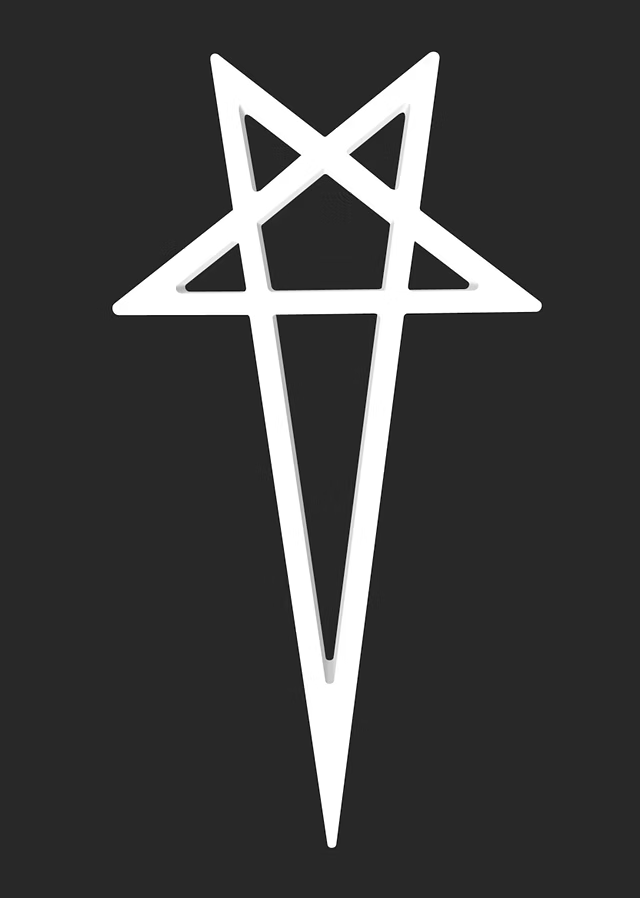
Yohji Yamamoto runs the identical playbook from a completely different emotional register. He’s spent close to fifty years working almost exclusively in black , not, by his own account, because he dislikes colour, but because colour draws the eye to a garment’s surface, and he wants your eye on the structure underneath it instead: how the fabric falls, how it moves, how it shields the person wearing it rather than putting them on display.
“My clothing protects you from unwelcome eyes,” he’s said, which might be the most precise sentence anyone in fashion has ever produced about what a silhouette can do that a logo simply can’t. You don’t need to read a label to know you’re looking at a Yamamoto piece. You just have to have seen enough of them to recognise the grammar.
THE HOUSE THAT ERASED ITS OWN NAME ON PURPOSE
And then there’s the most extreme version of all of this: Martin Margiela, who ran his own house for two decades without ever using a printed name at all. Instead of a label reading “Margiela,” garments carried a blank white tag attached with four visible white stitches , no name, no logo, nothing you could photograph and instantly identify unless you already knew exactly what you were looking at.
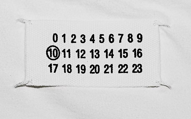
It wasn’t a gimmick. It was the same argument taken to its logical extreme: if the clothes are distinctive enough, the name becomes optional. The four stitches themselves became the signature. People who knew the house could spot it across a room. People who didn’t, genuinely couldn’t , and that gap, deliberately engineered, was the entire point.
WHY A LOGO IS EASY TO FAKE, AND A SILHOUETTE ISN’T
There’s a practical reason all of this matters beyond aesthetics, and it goes back to that Louis Vuitton irony from the very beginning. A logo is, structurally, a shortcut , a piece of information designed to be read in half a second, from across a room, by someone who’s never picked up the actual product. Which is exactly what makes it so easy to counterfeit: you’re copying a symbol, not a skill. A woven leather technique, a drop-crotch trouser cut on a very specific bias, decades of a designer’s obsessive commitment to a single shade of black , none of that transfers onto a factory line in Guangzhou nearly as cleanly. You can print a monogram in an afternoon. You cannot, in an afternoon, teach someone the exact proportion Rick Owens has spent thirty years refining, or the specific hand-tension a Bottega Veneta weaver develops after a decade at the loom.
WHAT’S ACTUALLY BEING SOLD
Put all of this together and the pattern is impossible to miss. None of these houses built recognition through a symbol slapped onto a product. They built it through obsessive, unglamorous repetition — the same shoulder line, the same proportion, the same palette, the same fabric behaviour, over years, until the eye simply learned the shape without ever needing a name attached to it. A logo is fast. Anyone can learn to recognise a stamped letter in about half a second, which is exactly why it’s the first thing to go out of fashion the moment everyone else has learned it too. A silhouette takes years to teach an audience, and it can’t be counterfeited nearly as easily, because you can’t stitch “elegant drape” onto a factory knockoff the way you can stitch four interlocking letters.
That’s really the whole illusion, once you see it clearly. We think we’re buying a symbol that tells other people what we paid. What the designers who actually built these houses were selling, all along, was something much harder to fake and much slower to earn: the simple, quiet fact of being recognised , by the people who’d actually know , without ever having to say a word about it.
All images featured in this article are credited to owners . They are used for editorial and illustrative purposes only, with no commercial intent. All rights remain with their respective owners.